 Back to Entry List
#1 - Graphic Design
(Originally posted on Tumblr on September 7th, 2022)

for this very first installment of my caddicarus history series, i’m gonna go full graphic designer brain on y'all. yeah, i’m turning it up to 100 already.
for brevity’s sake, i’m only going to be talking about the profile pics, channel art, and the thumbnails/title cards/logos of the caddicarus show. i’ll do separate posts about the other shows another time. but for this one, i’m sticking to the OG show we all know and love.
throughout its 11-year history, the caddicarus channel has changed a lot in its branding. that’s expected for a youtube channel, especially one that was started by a 17-year-old kid who would keep making videos into his late 20’s and beyond.
as a graphic design major who was 100% an autistic logo kid, i was fascinated by the channel’s branding. fascinated by how…interesting it was.
to put it lightly, the branding was very rough around the edges. but before i dive deep into that, let’s talk about how the channel looks now.
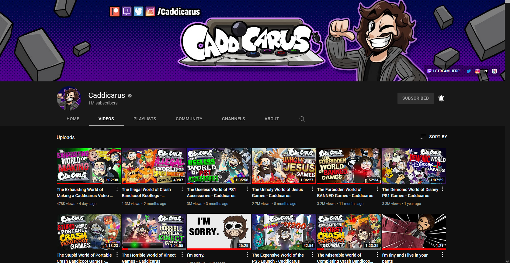
in the year of our lord 2022, the caddicarus channel has never looked better. this is personally my favorite branding the channel’s ever had! it’s very consistent, the color palette is beautiful, i LOVE the thick outlines, the character design for caddy is very clean and captures his cartoonish personality well. the shift from bright blue to these deep purples/dark indigoes gives the channel a unique identity compared to a whole bunch of other gaming channels that also use blue colors, similar to vinesauce with the color green. the halftone accents replacing the playstation icons help emphasize that caddy doesn’t only talk about PS stuff, yet the logo retains the asciiware controller, still showing his connection. this flatter version of jan animations’ logo works well with the rest of the branding, it’s like the cherry on top. it really gives the channel this glorious late 90’s-early 2000s feel. it’s a gorgeous branding by littlemisschii, who is a godsend to this community.
i could go on and on about how beautiful this branding is and how it’s the caddicarus branding younger me always wanted to see, but we’ve gotta move on to the brandings before this one.
this current branding may be sleek and clean, but it wasn’t always like this. in fact, one of the charms of the pre-2020 (or pre-august 2018 by extension) caddicarus channel was how mismatched and rough-looking it was. i can’t put too many images on here due to the image limit, but just scroll through the caddicarus channel and you’ll see for yourself how rough it was before season 11.
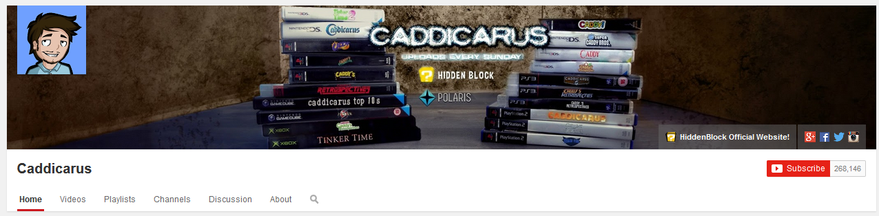
when i started watching caddicarus in august 2014, the channel looked like this:
(thumbnails won’t load on internet archive 😔)
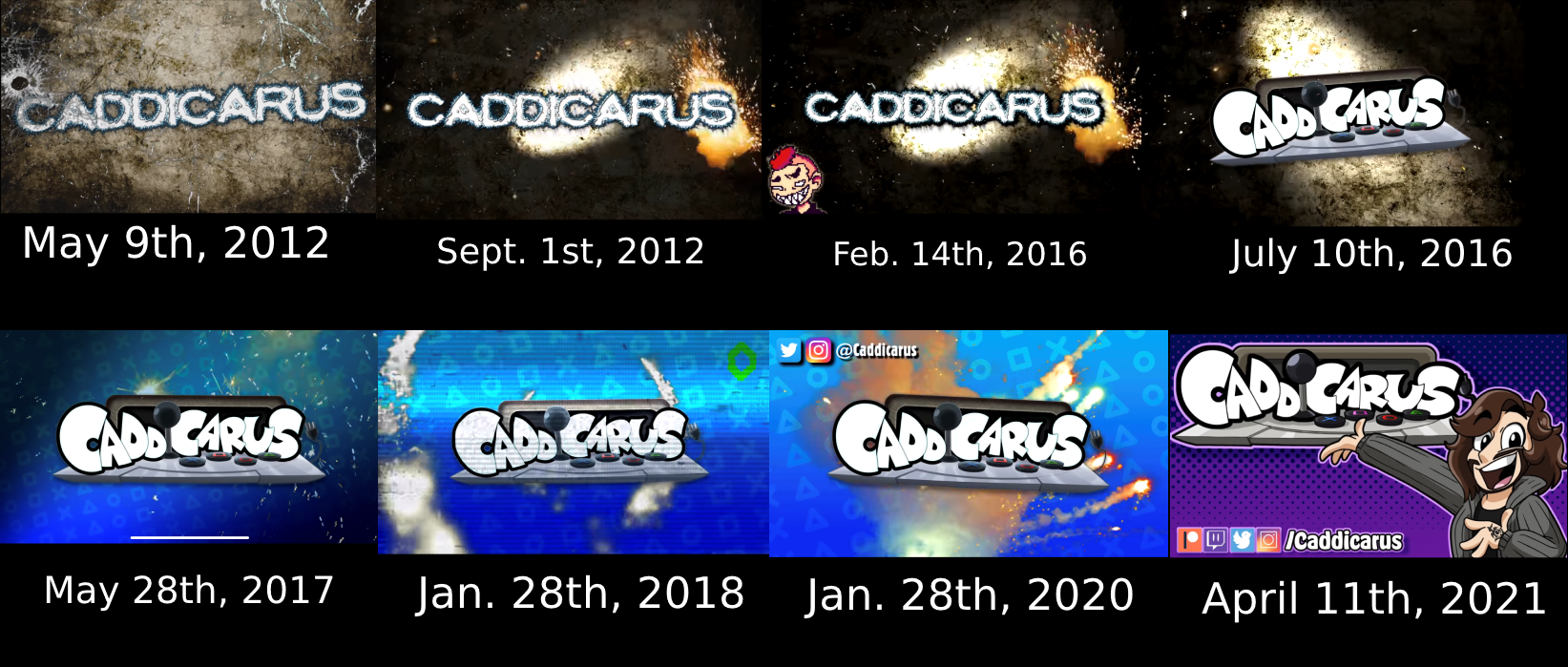
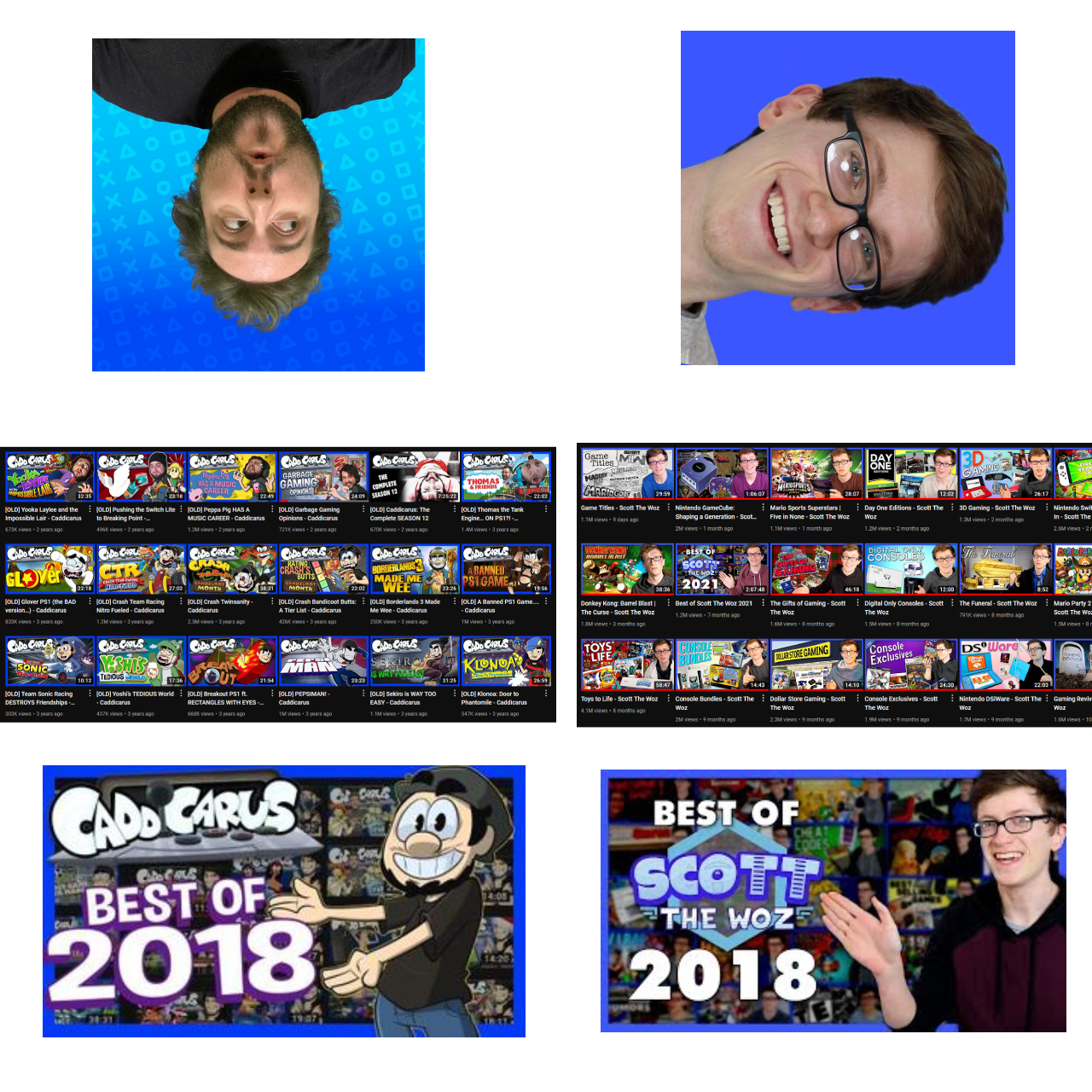
this was an AWESOME banner by whaddupnico/nico vliek (yes, the nico vliek who did scott the woz’s branding!) nico partnered with caddy for about 5 or so years, from 2013 to 18. in 2013 his first project for him was two t-shirts based on current quickies and jaws unleashed, and in 2014 he made this banner. nico designed a bunch of different logos for caddy’s 5 shows at the time in the styles of various video game logos. and in the center was that masterpiece of a cooltext.com-generated logo that was used up until the channel (initially) reached 500k subscribers in mid-2016. i can’t think of any other youtuber who got that high with a goddamn cooltext logo. it’s just so wonderfully caddy.
this was the channel banner until 2016, when season 6 premiered, the caddicarus show became weekly and the three-videos-a-week schedule was officially established after some experiments. after this banner was retired, every caddicarus channel art followed the same format: logo in middle, schedule/social media somewhere on the banner, and starting in july 2016 - caddy to the right of the logo.
here’s a dump of images i’m going to be explaining; i’m doing it like this to combat tumblr’s 10-image limit. this shows how much i adore this channel and the lengths i’ll go to preserve its history LOL.
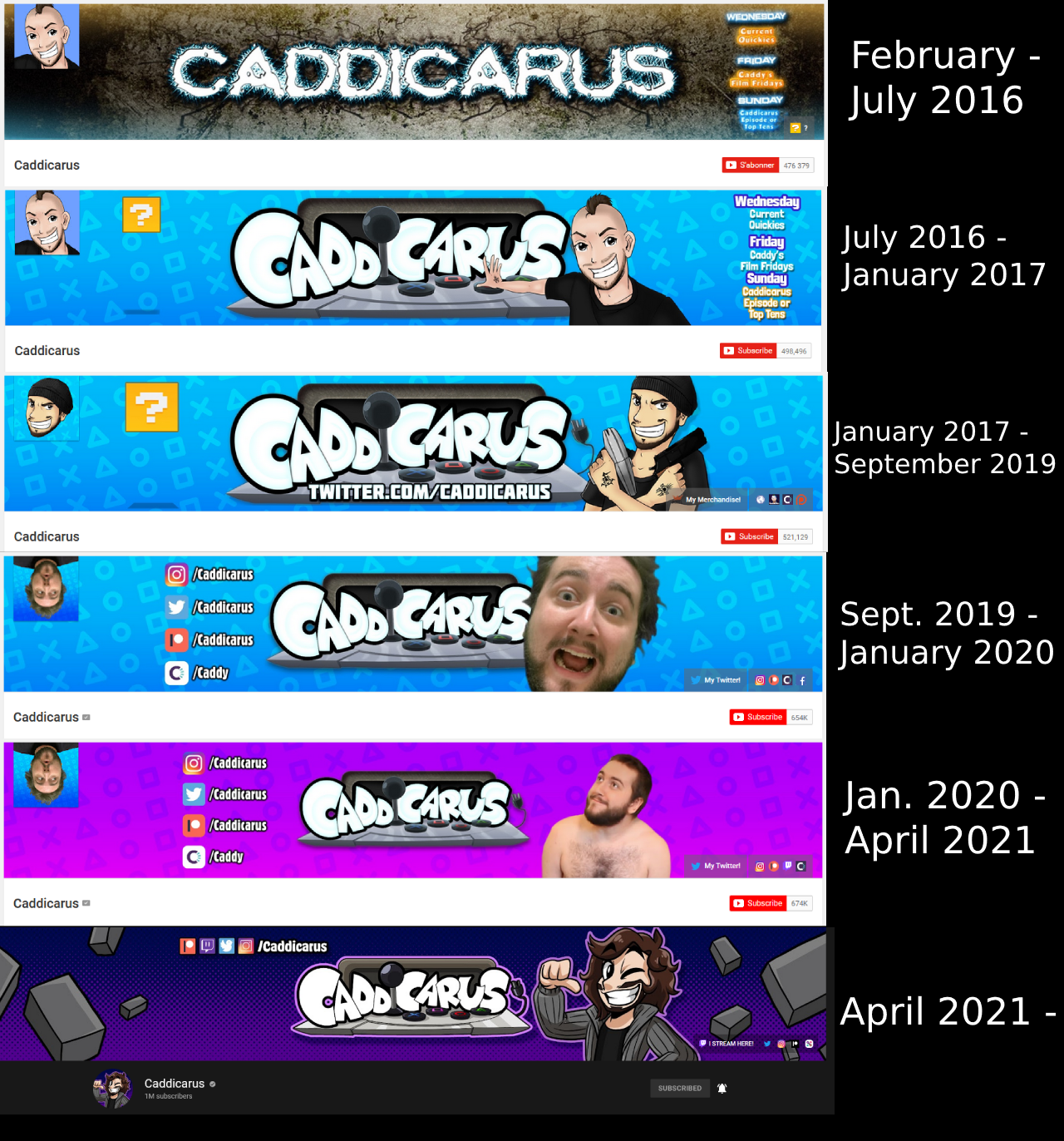
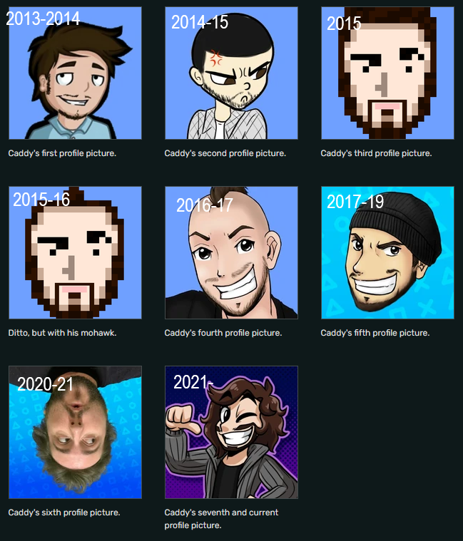
small error on the profile pics image: the sixth profile pic is supposed to say 2019-21 as it was introduced alongside season 13’s thumbnails featuring caddy’s actual face
okay, gathering up all those images and dates and compiling them together took a toll on me…now time to discuss them!
if you paid attention hard enough back in the day, you may remember how mismatched the branding was through 2016-18. the biggest example of this revolved around the blue playstation icons background.
on july 10th, 2016, the current logo was introduced to the channel. this logo designed by jan animations is the caddicarus logo nowadays - the first thing that comes into anyone’s mind when caddicarus is brought up. but of course, back when it was introduced, it was pretty polarizing. it was quite possibly the snazziest, coolest, fanciest piece of branding the caddicarus channel ever had! but it had its detractors…and they honestly had a reason to detract, because for the first 10 months of its use, caddy decided to use this cheerful logo over the grungy, unfitting background he’d been using for years.
but what’s even more slightly irritating about this is that only a week after the logo was introduced, caddy put this logo on the banner - using a blue gradient background with PS icons on it. this background was nowhere to be found in the videos, though.
but finally - starting with the shadowman episode - caddy added the new background to the intro! the logo fit!!
but…the thumbnails still had mismatched branding!!!
…until the debut of season 10, when the grunge was entirely taken away from the show and he added the PS icons to the thumbnail. it took him this long!
yeah, sure, it doesn’t matter in hindsight, but man did it infuriate me at the time as an aspiring graphic designer!
but at the same time, that was the charm.
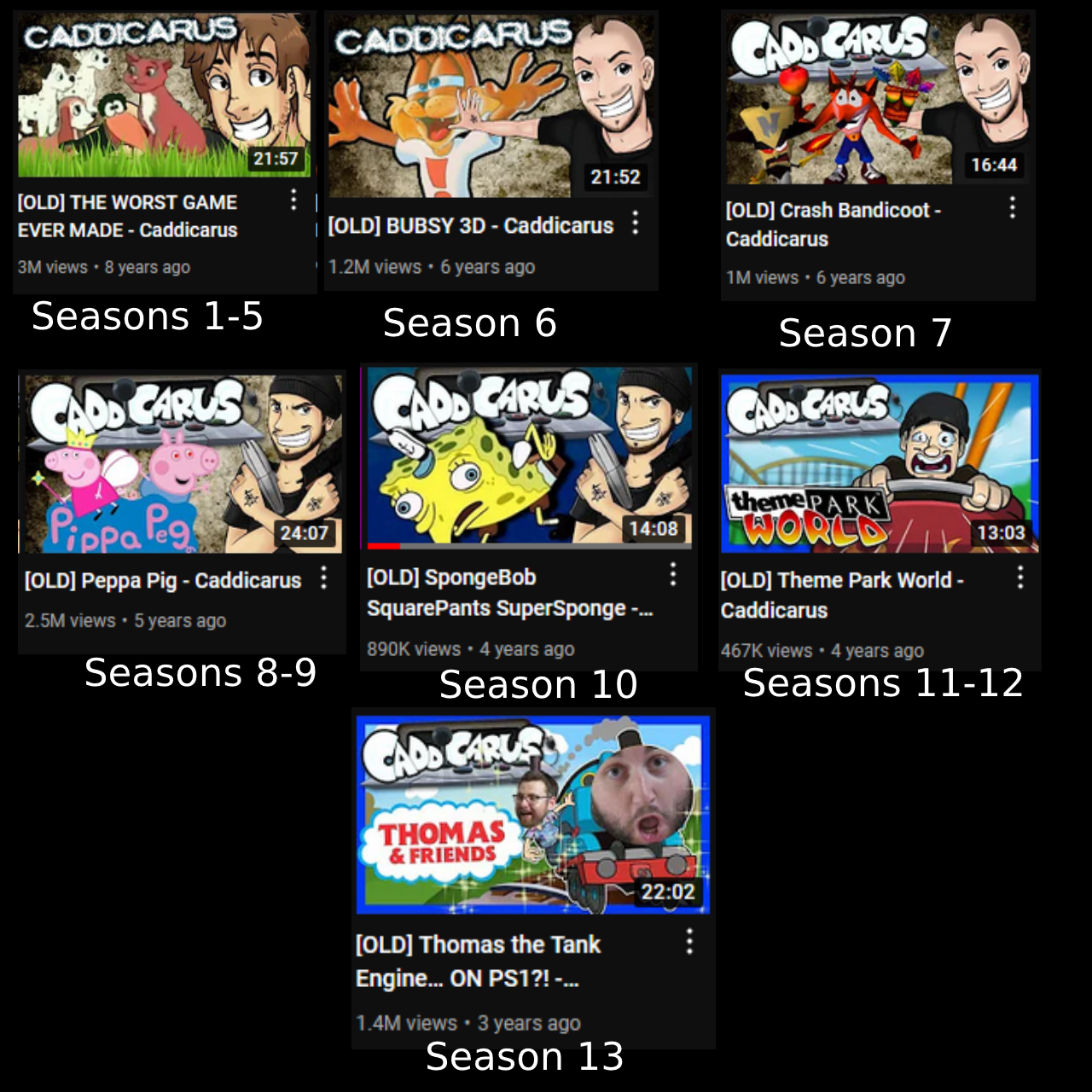
the thumbnail art…is a pretty divisive subject. but it’s also another one of the worst offenders of mismatched branding. until season 6, the same image of caddy was used on every thumbnail for every show (except for drive thru reviews). and there’s already a HUGE problem with this - this image was drawn around 2012-13 with 2012-13 caddy in mind. meaning…there was no beard, he had a scrawnier build, and his hair is longer. so…this image quickly became outdated as he began to grow a beard, but it became even more outdated when caddy shaved his hair in 2014. but he continued to use it. even into late 2015 after he’d gotten his mohawk. it got to the point where the thumbnail looked like some random guy rather than the guy in the video you clicked on. even the hair color was inaccurate! so beginning with season 6, we FINALLY got the thumbnail overhaul we needed.
and uh…it sure was a thumbnail overhaul.
of all the thumbnail art caddy’s used, this was the most poorly received. caddy’s mohawk and new hand tattoos were already polarizing among some viewers, and this new image didn’t help matters. common criticisms revolved around the animesque art style combined with flawed lineart and shading. this image was used throughout the rest of 2016.
then, after he moved to his current house in 2017 and artificially created reached his 101st episode, caddy updated the image to a new one drawn by the same artist. while this art wasn’t without its detractors, this was widely considered a massive improvement over the 2016 art and was welcomed with open arms. this one featured caddy wearing his beanie, so it could be a somewhat neutral, central representation of him should he change his hairstyle again.
this art was used until season 11 in august 2018, when jetpackbraggin was first brought in. you can scroll through his thumbnails and see how fast he got into the groove of drawing caddy; the first several or so thumbnails were pretty rough but it really started coming together by the spider-man episode. today, we have absolutely gorgeous unique thumbnails drawn by him for each new caddicarus episode! the thumbnails before had art and a logo that were both outsourced, but when it came to how jim placed things on the thumbnail…it was kinda messy lol. he’d make images too large and it would cover the caddicarus logo…you couldn’t read the name of the show you were about to watch for some videos hahaha. these new thumbnails from JPB gave the channel a cleaner look.
and also, for seasons 11-13…the blue borders came in.
images that make you go hmmm…
you can really see how desperate he was here 😔
so if this post has taught you anything, it’s that caddy himself isn’t the greatest at graphic design LMAO. but i’ll say it again…that was the charm! the caddicarus channel looks drop dead gorgeous these days, and i could gush over that forever, but man there’s more and more people every day who either forget or don’t remember how wonderfully awful everything used to look. it’s just one more thing that made caddy stand out; a lot of other gaming channels had/have super sleek branding with a whole team of writers/producers/business people/whatever. but caddicarus - even after all the changes and branding outsourcing - has always been caddy’s baby. it’s his show and his show only, and that’s what makes it so special! 💜
i hope you enjoyed this first installment of my series!
 |
| 